Designer's Comments
Look carefully for specific instructions
it'd be nice if you commented if you used it :)
but you dont have too :)
Using This Layout
For specific instructions read designer's comments
- This is a div overlay layout, html knowledge required!
- 1. Log into myspace.com
- 2. Click on Edit Profile (Profile 1.0)
- 3. Copy (ctrl c) and paste (ctrl v) code to the specified fields
Layout Comments
Showing latest 10 of 16 comments

Woah. It's really simple. But its cute,
and these comments are crazy longg!

this is very cute. i love how the picture appears like that.

This layout has go to win for the longest comments in the history of layout comments.

Nope no porn on my PC, its called Australia internet. I heard we have shit slow stuff. Its sad.
But oh well.
Drop the argument regarding PNGs and JPEGs. I will always hate them, and u will always love them. Thats the way it goes.
And good on u for sayn sumthing nice about this sweet layout.
xo

Becc, PNGs do not suck. Horrible quality = suckage, but thank god PNGs have good quality. It shouldn't be that slow to your computer anyway. Get a better connection or delete some porn off of it.
btw, pretty cute layout.
Nup. PNG's suck. Thats all there is to it. I generally save as a PNG then save as a JPEG than dont re-open it until I post it wherever. This assuresthat I get the same quality as a PNG with the "smaller size" attributes of a JPEG.
A JPEG image can be 67KB, whereas the same image as a PNG can be a freaking 700KB!
These definitely slow down the browsers and if ur in Aussie where internet isnt as fast a capable as it is in America... sadly only half the picture comes out then it stops downloading,
End of storry, thats how it is. therefore, I dont use PNG's. I hate them!
I also dislike every layout on here that uses a PNG. I never use them because I get bagged by my friends every time, and my Myspace isnt so "cool" after allm rather a "try hard" waste of people's effing time.
No thanks.
I prefer a bit of blur and a better reaction.
I also noticed everyobe was picking up on the most rediclous things to say about this layout/
One or two mistakes, for sure....
But some of the comments are rediclous and sound nothing but self righteous, and critical.
xx

Hey, I hope you won't mind me adding this, but I think the coding in the Heroes section has a little typo. Not sure if it should be:
div class="off"
Instead of:
divclass="off"
But anyways, to becc23, PNG's are not bad at all. Some PNG file sizes have a large range, so it really just depends on the image. In fact, some PNG files are lighter than a GIF file, though it's not that common. The only reason I wouldn't use it is that many browsers process it differently, particularly a PNG's transparency attributes.
I actually love this layout.
the advise about changing the pictures to PNG is rediclous advise that I would never take.I never use a layout that has PNG background! Ever! This is because they take FOREVER to download. Every person I know who has myspace, when I tell them, "Oh, click that person's profile," they will click it, and if it stills or freezes or takes more than the normal to start downloading, they go back! Also, my friends rarely used to return my comment because, they told me, my profile took to effing long to download ( i had nothing but a PNG DIV layout), and the page was a mess. I later found out that only half the image would download and they couldn't work out what was wat. Because, often only half of the PNG picture will show up. The LAST thing you need in a DIV layout.
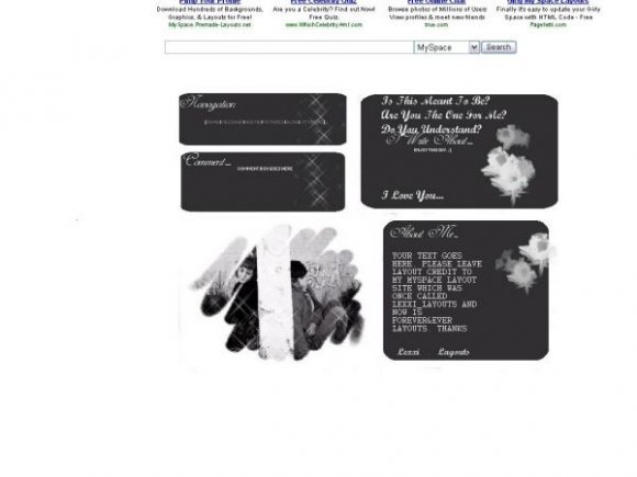
I love this llayout, it is gorgeous. Very simple and neat, unlike some of the layouts here which just have too many images. The eye gets distracted and confused when there are so many boxes clammed together on one page.
This is a change and is very sweet. Who cares if the foto is fuzzy, I'd rather that than a PNG.
Not sure if this has been brought up already, but the text in the layout is misaligned. As for the layout image, I think you should try adding some more color to it, instead of keepin` it grayscale. I would also suggest making the corners of the rounded boxes more even, as well as anti-aliased (cause it looks a bit pixely). The image at the bottom left looks good, but again, I'd suggest adding some color to it. :]

Cute, I like the font you used.
And about the criticism thing, I don't think there is a need to critique on every little thing you don't like about some ones layout, its annoying. Im not saying this to any particular person, Im just saying in general.
Layout Details
| Designer |
akforever
|
| Submitted on | Jun 28, 2007 |
| Page views | 90,200 |
| Favorites | 306 |
| Comments | 16 |
| Reviewer |
digitalfragrance
|
| Approved on | Jun 28, 2007 |